Category Archives: PART TWO

Reflections on part 3 feedback

Printing was completely new to me, but my tutor picked up on the fact I really enjoyed it, which is great to hear!

Ex 3.1 – highly expressive and different brushes helped it stop being too fussy

Ex 3.2 – good selection, basic portraits but highly expressive, really likes landscapes [prefers second striped to first which I wondered if overpainted!], bold, has energy

Ex 3.3 – works on black are effective. Mark making bit repetitive – lots of shorter strokes suggest lack of confidence, try more varied with fluid marks

Ex 3.4 – sensitive mark making and delicate colouring. Monochrome worked particularly well – don’t be too tidy, charm of this is surface textures

Assignment – Red and black is particularly striking and have iconic poster look, sense of movement. Middle portrait – delicate fine lines produced work of sensitivity even though proportions not quite right.


Reflections – try to use different marks, not just short repetitive ones, don’t be too tidy, try more fluid marks.

Great advice once again and will try to build on this for assignment 5 as printing has become a new favourite of mine!

Reflections on part 2 feedback

It was great to read there was some interesting work, as I have tried to experiment, and still life type things have never been my favourites.

Main points –

  • coffee painting was most successful in the 2.1 exercise. But also feels milk churn enamels show possibilities. Think of building it up in thin layers.
  • 2.4 – watercolour quite successful, but not the others – look rushed and shadows make the subject look confusing. Yes I could see that – the shadows were too prominent. Composition good though and subject matter interesting.
  • Buildings landscape worked well. Right to let copper shine through. When painting enamel on metal use flatter brushes to avoid tramlines. Smaller medical objects work well even though not carefully described – leaves viewer guessing as to function
  • sketchbook a little random – lots of different work – need to organise better
  • blog is interesting and relevant – good to be inspired to tackle new things.
  • look at Michael Borremans and Rezi van Lankveld


I agree with all the points – trying out new mediums means some things don’t work as well as others. I do like enamel on metal so using flatter brushes is a great tip. Thinning them out could help too.


Art gallery visit – Tate Liverpool, Walker Gallery and Bluecoat Liverpool

Liverpool has a fantastic collection of galleries and it was interesting to visit a diverse range, starting with the old Walker Gallery.

I was disappointed to find the room with Peter Doig’s ‘Blotter’ shut for refurbishment. I had seen a similar mid 90’s period work at the London Tate Modern and had been keen to compare but it was not to be.

IMG_9332

Lucien Freud – Interior at Paddington 1951

The figure here looks a bit unkempt and seedy, with flying hair and a rather odd clenched fist. I have read it is supposed to emulate the stance of Henry VIII paintings. The perspective of the figure is odd, he looks short with short legs and he fights for compositional priority with the potted plant that looks like its winining! Its a paint style I admire, but am not really drawn to – its flat and I find this makes Freud’s faces look sort of inhuman and lifeless. In contrast the plant looks realistic!

IMG_9331

L S Lowry – The Fever Van 1935

I particularly like this Lowry painting. The composition using the ambulance as a distant view is interesting. It makes me feel like I’m part of a wider community ogling it from afar. Having a fever van come must have been a worrying thing, I can’t imagine the survival rate from a trip in onw of these was that high in these times. This local community would have known the patient. The forground houses are red, and the background more blue – grey. The smoke stack belches its smoke over the whole sky, casting shadows on the houses and there is no illusion this is anything but an industrial urban scene. As always, there are dynamic figures about, wadering dogs and plenty going on.

IMG_9333

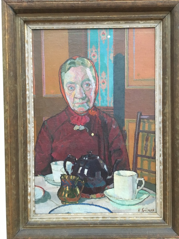
Harold Gilman – Mrs Mounter 1916

I love this non glamourised figure, seated in front of tea, but still wearing all her outdoor clothing! The blue in the wallpaper is echoed in her face, and reminds me of Marlene Dumas portraits. Her stare is direct and a bit challenging. One eye is higher than the other. It looks like the artist knows this lady well! I’ve bought a book on this artist as I liked this so much. I have read that sadly he died young.

Tate Liverpool

It’s been 25 years since I last went in here, disappointed at the displays of piles of bricks. I know my thinking has changed dramatically about contemporary art, but I’m still not sure I want to look at bricks for long.

IMG_9347

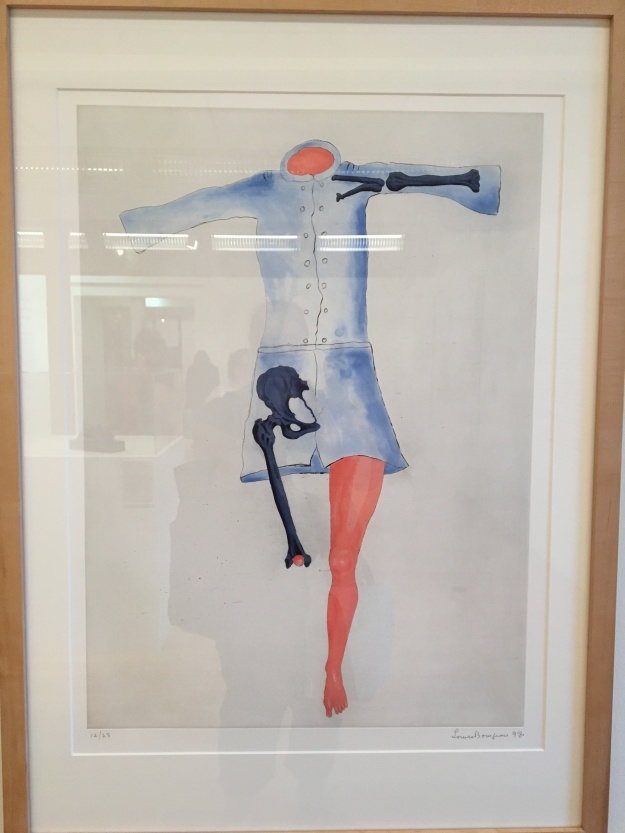
Louise Bourgeois – Blue Dress 1998

I’ve been intrigued with this artist after seeing her show at the Tate Modern a few weeks ago. Also, an old interview where she jsut decided the interview was over and left the room! I liked the idea behind this painting – the bones are well drawn and unexpected additions to the dress! A lot are missing too. Its odd, and interesting.

IMG_9349

Marie-Louise von Motesiczy – From night into day 1975

Here is the artist’s mother, who was losing concept of night and day when this was painted. I like the painterly style and attention to objects. The facial expression looks appealing, as if this is a happy lady, despte being confined to her bed. The dog looks concerned.

IMG_9351

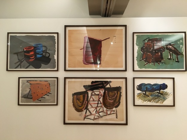
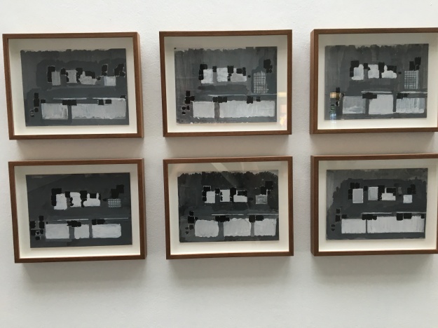
Phylida Barlow 1997-2004

These are drawings made prior to sculpture. I liked the simple subjects, made interesting by using so many different paint marks!

IMG_9352

Phylida Barlow – close up

This close up shows the different marks – a lot of dry brush strokes and I admire the good drawing. I’ve struggled with making ‘everyday’ objects look interesting and will take some inspiration from this.

IMG_9356

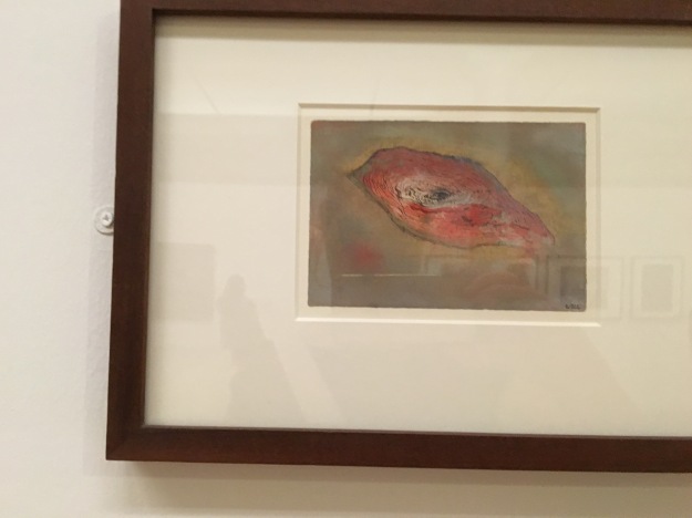
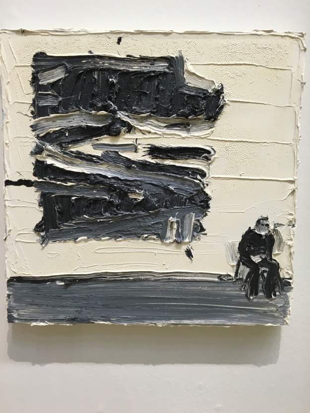
Wols – untitled 1944

I was drawn into this one because I was wondering what on earth it was. It could be a cut of meat, an eye, female genitals, a tree cross section. Staring at it for a while, I still wasn’t sure. It has made me think how I could do that with an object, make it so ambiguous? I will try to think of something.

IMG_9354

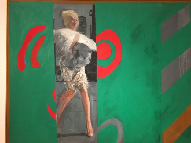
Pauline Baty – The only blonde in the world – 1963

I like this loose style, the paint looks quite feathery and gives movement to the paitning. The title makes it clear who the subject was. What I liked here was the composition, like it’s being viewed through an opening curtain as if spying on her. Again, an idea for the future.

Bluecoat gallery

I was fortunate to catch the Bloomberg new contemporary show here. To be honest, a lot left me cold. There was not much information with the works and only a display copy of the catalogue, so it was hard to read to guess some of the intent.

Above is Michael Coxs’ work ‘De Beauvoir’ and ‘Aylesbury’ 2015.

I’m guessing these are condemned builidings. I like how nature is starting to reclaim it in the second one. In the last few weeks I’ve seen quite similar old council blocks in many exhibitions – in the RA summer exhibition, the Ruskin drawing prize and Mandy Payne’s at the John Moores painting prize. I was starting to feel a bit weary of this subject. The first in particular did not hold my attention like others of the genre, there seems less to look at than Jock Mcfadyan’s below at the Summer RA show – which had a more interesting perspective in my opinion.

IMG_8720

Jock Mcfadyan -Pink Flats 2

IMG_9359

Jack Bodimeade Plug 2016

I was suprised to find myself liking these plug sockets. Who would have thought these could look interesting? It reminded me of Alex Hanna’s radiators!

IMG_9366

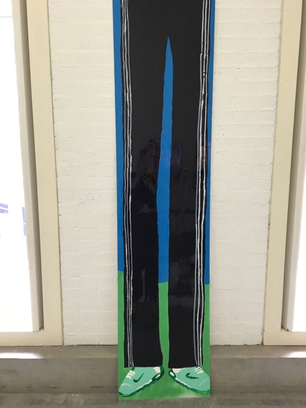
Alfie Kungu – Big Al 2016

This appealed to me because it was spray paint on aluminium and I’ve been developing my skills with that lately. This is large, the legs are the size of a whole human. Theres no persepctive about it  – the shows are naive in style, but it appealed to me.

I read some of the comments in the visitors book, many were extremely negative about it. A lot of ‘rubbish’ ‘disgraceful’. At least it gets a reaction!


Art gallery visit – John Moore painting prize, Liverpool. OCA study visit.

A 6 hour round trip on a sprinter train was well worth this visit. The biennial painting prize is exhibited at the Walker Art Gallery, which hosts an impressive collection by itself.

IMG_9337

Steph Goodger – The Unclaimed 2015

This immediately caught my eye. It is the macabre kind if subject I’m getting drawn to myself these days. As a group we stood round discussing what era it might me from. The moustaches suggested South America, but the velvet coats and lace collars were more 19th century. The unclaimed was an intriguing title and gave some clue as to the subject.

I liked the good drawing, but loose painting technique, thin dripping paint, thick in places. Some faces had detail and some had none at all, which lets my imagination in. The colour palette binds it together, with ochres, greens and dark red repeated throughout.

I was in a minority liking it in the group. The subject was too grim for most. It is actually dead bodies from a Paris commune uprising. It was painted from a photograph of arranged coffins. I wonder if the government did that to publicise consequences to the public.

Its a painting that leaves me looking and wondering, about the lives of the people and what they went through. The artist comments that there is a sense of emptiness. of people fading from the world, and I can really connect with that. I do feel this is where my personal voice is taking me. It reminds me of the Laura Lancaster work at the Walsall gallery.

IMG_9336

Gabriella Boyd – Birthyard 2015

Here is another painting I was in the minority of liking! We wondered if I liked it because it sparks a memory of me working in the labour ward as a doctor in the past. Certainly a different exerience to this scene. I like the title – it implies a mecahnistic process of bodies giving birth in rows like a factory. The style if naive – even the ellipse on the pot looks deliberately drawn wrong it’s that bad! A sinister looking part head and arm waits down one end for the baby. The babies eyes look a bit demonic to me.

The paint is flat in places, reminding me of Hockney.

Under the knee flexures there is white negative space, which doesn’t flow with the floor colour which our brains tell us should be there. It all looks basic – flat tables, tiled walls. I don’t know what that pot and stick are? Why is the abdomen of one woman painted red and the other not? Again, a lot of questions not answered. The catalogue couldn’t answer them either, in the way the first painting made sense after reading the artist’s thoughts.

IMG_9342

Talar Aghbashian – Untitled 2015

Here, the strange perspective of a large hand caught my eye. It draws me in to thinking what could this be about? Its the statue of an assassinated politician, and it resonates with memories of toppled statues after people revolutions. I like this because it makes me find out more about the subject, like the Parisian communards above. The painting style appeals to me – the marks are bold and direct.

IMG_9335

Enzo Marra – Invigilator [John Virtue]

This painting is quite small compared to the previous ones- only 52cm squared. I liked the thick paint and how the grey isn’t really mixed that well. The figure looks a bit Elvis like to me. I like John Virtue paintings, and researching this artist, I see he has painted a John Virtue painting on the wall in this work. Its quite an ‘in joke’. It looks a casual style of painting, but I imagine its quite hard to get form with such thick paint. It reminds me of Frank Auerbach’s style. His paint can be so thick the portraits look 3D!

Finally, the group visited the tutor Donol Moloney’s exhibition at the Liverpool Gallery ‘a small view’. This gave us a real chance to listen and question him about his work.


His ‘Cave Painting’ was also exhibited in the John Moores painting prize. The work above is ‘new works on paper’. They are intricate and the sources are taken from internet images, sculptured plasticine and formed in a collage like way. He uses water based inks and acrylics to slowly build up the collection, which can take up to a year. In the first painting for instance, there are unexpected candle flames, jewels, amongst the weeds, flowers and caterpillars. His paintings take some looking in to and are well worth the effort. He explained how he has bits of modelling clay that he twists into shapes and draws. A great deal of patience is needed for this technique and this visit was a great end to another study visit.

References

  1. http://www.donalmoloney.net/


Exercise 2.1 part 2

After finishing assignment 2, I decided to go back to a previous exercise and try a bit more experimentation with enamels. I had not really been happy with the results of the jewellery collection from this exercise using the acrylic ice blocks [certainly I’ll be taking away the point that I shouldn’t have added so much water to them!].

IMG_9176

I tried the jewellery and sock in watercolour, which gave me the idea of trying them in Pebeo enamels.

IMG_9179

IMG_9178

I wondered how these would work on black and white paper. The reds were not great on black paper, but the lighter colours certainly stood out.

I tried using a bit of Humbrol thinners with them which worked well. Also, pouring dark paint in to a pool of light, and vice versa. All had interesting effects!

Next, I went on a sketching morning to a local reclamation yard which had many interesting old things stacked up together. Plenty of interesting shapes to draw.

IMG_9177

This was an old milk churn with various bits of wood and metal stacked around it.

This time I tried Pebeo vitrea enamel, which are meant for glass but I wondered how they would look on paper.

IMG_9174

Actually the colours made certain objects really stand out compared to the drawing where all but the milk churn ended up a grey mass! Thinning some enamel and using dry brush also gave interesting effects. I haven’t got that many colours but enough to get a shadow and rust effects.

IMG_9175

This was a collection of objects in the corner of the yard. I liked the flowers in an old chimney stack stacked next to a wheelbarrow and modern watering can. Again, it was about keeping it simple. This enamel is thinner, more like nail varnish than Humbrol enamel paints but much easier to work with that nail varnish – I found the quick drying time of that stuff just frustrating!

My last feedback has helped me think more of the process rather than getting a finished piece from these experiments. I may have another go with the acrylic ink ice cubes with no water this time!


Non course work – part 1 and 2

I continue to attend a monthly life drawing session that is untutored. This really helps me just to let my hair down and try out different mediums. During D1 I experimented with a lot of drawing ink and acrylic.

Last month I tried painting in acrylics – the three primary colours and seeing what I could achieve. The last was the longest sitting at 50 minutes, so it tends to be loose. In the first two I didn’t mix the colurs much which produced an interesting effect. In the the last I did mix on the palette which became more conventional.

In the second session, I used new Atelier acrylics and mediums to experiment with using them like oils and thinning like watercolour. These range from 20 to 50 minutes. I increased my range of colours with blue-black and burnt umber and the primaries. I think limiting the colours is giving me a better sense of mixing.

IMG_9148

I went to a monoprint workshop because I see that is coming up in the next part! I also tried a linocut. Lessons learnt – care with the amount of paint is vital! Can only be learnt by experimentation! Also, simpler shapes come out better. After a couple of hours I gained in confidence. Trying out different papaers including tracing papers gives me ideas for the next part.

The first is from an oil paintng class I attend which teaches the traditional techniques of thick over a thin tonal underpainting and has been very useful. The second is from a plein air workshop with Haidee-jo Summers where she taught me how to see the view in colour and tonal blocks and stop trying to make it too complicated. My outdoor paintings have been over fussy and mostly disatrous until now. Her tips helped me enormously to look at shape masses.

Assignment 2

For this assignment I decided to just experiment and not worry so much about the outcome as my tutor suggested in the last feedback. Also, to keep it simple!

I’ve most enjoyed experimenting with enamel on metal – watching it interact and not interfering too much, apart from a little tipping of the surface or using a cocktail stick to mark within it.

Here are a couple of experiments with black and white enamel on copper offcuts. For both I was really just messing around, seeing how it mingled thick, painting with thinners and drawing within it using sticks. The second was more structured, but I liked how the white paint formed patterns within the black enamel of the river just by leaving it alone.

Here are a few more sketches and experiments in enamel, using aluminium plate this time. The aluminium is untreated offcuts, as I feel the cheapness of these allows me some freedom to not produce a finished piece! I felt like I was starting to get to grips with using the enamel loosely, allowing some plate to show through – otherwise why bother using it?

I also tried Schminke aqua bronze and acrylic on aluminium plate for this sunlit tree trunk above. Thinned paint has to built up in layers and over a few hours I think I got an interesting bark effect. However, for assignment 2 I decided enamel really suits metal support better.

I decided to develop the exercises from earlier in this part, where I used subjects I really associate with. From experience these have better outcomes for me than things like cups and plates which bore me even before I’ve started! The medical instruments appealed most, as I use them so much and when I lose one I really feel its absence!

As influences, I have enjoyed looking at the artist Annabel Dover.

Her simple depictions of subjects and putting together of collections has been interesting to look at.

IMG_9045

Hervin Anderson’s arrangement at the New Art Exchange exhibition gave me the idea of arranging multiple paintings together. This has much more impact than if it were one painting alone.

Looking at Alex Hanna’s simple compositions has also been influential. The subject occupies a quarter of the support. The tones are very similar between subject and background, but it remains very effective.

Sketching out ideas, I decided to go for only one object each small aluminium panel. I decided that cramming in too many would not add anything, having seen what piling on more stethoscopes in layers had ended up less successful in an earlier exercise.

I had nine small aluminium panels. From earlier experiments on the copper, I decided to paint the backgrounds first with enamel and let that dry as this allowed the paint to do its own thing.

The background paint was very thick, so after a few hours I painted the subjects on it, to give a bit of ‘wet on wet’ look and also this meant I could not fiddle with it – what was painted could not really be changed and mistakes had to be left in. I set up the objects on black card with a bright light to one side. I didn’t have them central, with some having parts coming out of view.

The finished panels. Some worked better than other – I think the glove started to lose its form as I overworked it. Too much paint on the end of the swab meant it bled. The mouthpiece of the inhaler was wrongly drawn so later I corrected it with a cocktail stick. I liked the medicine bottles, needle and stethoscope the best. I kept the colours as realistic as possible.

I tried out a few arrangements, with the final one being my favourite, as I hope the eye goes tot he centre panel and then around the outside. I got my family to guess the objects, they got about half right, which isn’t bad!

Reviewing against assessment criteria

Demonstration of visual skills; These are simple drawings in paint really. But drawing wet in wet does need some confidence. They are not perfect but perhaps the roughness adds to the interest? I liked experimenting with composition of the individual objects -I took a few photos of each before selecting the final one. 

Quality of outcome; There is a coherence in this series that there wasn’t for assignment 1. Can the viewer guess what each subject is, maybe not – does that mean they’ll look longer at it, or just give up! In particular the ear protectors for my thermometer in the last panel are hard to guess, but they are interesting shapes, like two little hats. The glove got overworked and I wish I’d left it earlier, I think that lost its freshness and form

Demonstration of creativity; I’ve never liked painting still life, so to find a collection that I found personally interesting spurred me into thinking more creatively. I think this is a better outcome than if I’d just painted the whole lot jumbled together. This felt more creative than satisfying than painting these objects together. Enamel on metal is completely new to me, and I’m really hooked. The glossy finish, and the way it interacts makes for an interesting outcome. Painting with oils after this seemed almost too easy!

Context;reflection; Finding the British Contemporary Painters [1] was great inspiration. I bought a few catalogues and found Alex Hanna and Annabel Dover in there, amongst others. In the last year, I feel I’m starting to get out of the rut of painting familiar subjects like landscapes, and going for things I know about and care about. Being a doctor is still a big part of my life, whether I like it or not sometimes, and using this experience [and of the experiences of patients I am privileged to witness] is certainly helping me to find my voice.

References

  1. http://www.contemporarybritishpainting.com/wordpress/?page_id=46

Gallery visit – Hervin Anderson and Beverley Bennett, Nottingham New Art Exchange

This is my first visit to this gallery in Nottingham. It’s small, with two large rooms only but it seems to have a diverse program.

Hervin Anderson

Hervin Anderson is Birmingham born to Jamaican parents and his artwork references his time growing up there, and his time living in Trinidad.

His process is very slow, taking many months to produce each work. Some preparatory drawings were included in the exhibition which was interesting to look at the process.


There were titles, but not next to the work, which I always find makes it harder to interpret. The titles largely didn’t give any clues either – ‘Ebony’ and ‘B.H.B’.

The blocks look like possible furniture or room arrangements from above. I wasn’t sure how they related to anything else. The 6 arrangement gave me an idea for assignment 2 though, which is to arrange multiple paintings on small plates together.

I really liked the trees, they have an interesting variety of colours and marks.  The prep work was detailed, almost a finished work.

IMG_9029

Hervin Anderson – Is it OK to be black? 2016

My favourite was this work. Many of the faces are stripped back, which is what the artist is aiming for now. With this current climate of needing a campaign about ‘Black lives matter’, he has a very valid point about ordinary black people doing ordinary things not being depicted much in art. They are either sporting heroes or leaders usually. At the bottom is a ‘cityscape’ made up of grooming products -maybe this references his earlier works set in Carribean community barbershops?

Beverley Bennett

These drawings are from the artist’s series ‘Dissonance’. The repetitive mark making does have a sense of energy within it. The pointed shapes also make it feel quite contained. They look like they’re raining down with sharp ends, like swords. I wonder what it would be like in colour. It reminds me of Ann Christopher’s exhibition I saw at the Royal Academy and I think I preferred her variety of marks and colour to this.

Certainly an interesting place to visit, and it will be on my radar in the future!

Exercise 2.4

I was looking for a different collection to paint and came up with the idea of my medical equipment that sits on my desk. Also packets of pills and inhalers are interesting shapes.

I used a watercolour ground, black, quinacridone gold and purple in various combinations for a light and dark effect.

IMG_8977

This was my watercolour effort for the medication collection. Again I’d tried a few combinations for the composition and settled on this jumbled combination. I like the shiny pill packets. The front of the pink inhaler got a bit messy but it wasn’t a bad effort. I used white gouache for the white highlights since there was no white of the paper. I put the composition all off centre too which I’m realising is better than plonking it straight in the middle!

Since I painted it, I found this work by Alex Hanna above and I really like his very bare composition. Maybe I add too much – thought for the future is less is more!

Next I tried gouache only but I didn’t like it much, the shadows were too strong and I added too much complement colour so that the shadows looked like solid forms! So I decided to experiment with this one and paint on top more stethoscopes in acrylic. I think their jumble improved it and made it more interesting. I also toned down the shadows first. Still struggling a bit with gouache, it can look solid and dull very easily in my hands.

IMG_8975

The last is in acrylic. Better shadows. I like the c omposition of the ear bud being very forward. This is my style of loose brushstrokes and trying to make an object out of the minimum marks to keep it looking fresh. I failed there with the pulse oximeter which needed revisions to get the correct shape. A bit of complement colour in the shadows worked this time.

I like these collections as they do say something about me. I use these things all the time – apart from the bottles of penicillin but I thought they were interesting shapes. I do think I paint better when I’m interested in something – thats maybe where the jewellery and pots ones were less successful??

Exercise 2.3

I had a few stones handy from beach holidays and decided to use these. Some were smooth and some rough surfaced.

The small surface is not easy, especially when you’re trying to paint a straight edge on a curving stone one!

The shoes was my favourite – simple objects in bright colours showed up well. The nail varnishes was  maybe too ambitious. Family could not guess what they were. The cups from above worked OK, I liked the circular bold shapes. By the time I got to the small stone I realised I needed a larger bold shape, so two fork heads came out reasonably well. Painting on stones is harder than I thought. I have much admiration for Paul Westcombe and his detailed drawings on coffee cups!

I would like to have a go on a larger piece of slate if I can find one on holiday in Wales.