Monthly Archives: October 2016

Exercise 5.4


I have to admit at first I thought this exercise looked crazy, who wants to paint rubbish?

Then I was inspired by a recent BBC program ‘Whose afraid of conceptual art’ which started with the presenter carefully opening a box with a scalpel as instructed by the artist Martin Creed [1] and revealing a crumpled up piece of A4 paper. A look at his website showed he had made this in 1995, and was now selling replicas for £180.This made family members roar with laughter. So I decided to make my own crumpled piece of paper, but this was still an idea stolen from Martin Creed, so how could I make it my own? When my back was turned, I found the crumpled ball had gained a sharpie ‘face’!

This is how Martin Creed’s work is presented, does the box and opening instructions make it feel more like art? I must admit that I thought his idea of turning on and off the lights of a gallery to make it art was a genius idea.

fullsizeoutput_2023fullsizeoutput_2027fullsizeoutput_2029

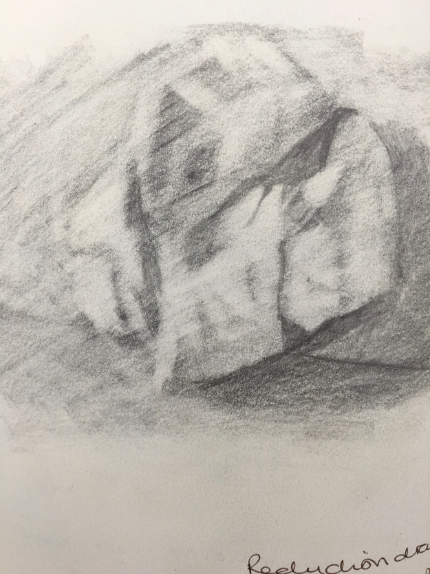
I drew three images – the first a tonal drawing, the second a reduction graphite and the third a blind contour drawing. I was struck with what beautiful shapes the crumpled piece of paper made.

For the first painting I was inspired by the painting of Barbara Howey [2] and Alex Hanna who I have discussed previously in this blog.

I liked Barbara’s use of tones here, its subtle and harmonious.

fullsizeoutput_202e

I tried out tones using cad red/yellow and ultramarine blue and decided most realistic were on the bluer side. I lit the paper with a bright light from the left and used a white background.

img_0289

I used a thinned paint background, and wet in wet for the paper. I think this worked quite well, as there is the sense of a solid 3 D object there. I left in a lot of brush marks to add interest. I only used one paper ball, as I thought adding more wouldn’t necessarily make it more interesting.

For the second painting, I decided to try a black acrylic background.

fullsizeoutput_202b


I tried realistic tones again, but thought it too similar to the first painting. Then I tried other red, green and white which looked vibrant on the black. I couldn’t get the right textures with a brush, so I tried cut up card and that added interesting texture marks as well as straight edges and scraping some of the paint back.
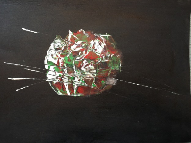
fullsizeoutput_2032

A3 acrylic on paper

I used ‘unlocking formula’ on the right side to blur the paint a bit as this was in shadow. I added one line for the back edge and then a few more because I liked the effect of dragging the card through the paint. This was a successful experiment in terms of trying out new things. The outcome maybe looks like a ball of wool and needles? It is quite abstract, but certainly something I can develop in the future.

I was interested in the effects of acrylic paint on masking fluid and candle wax marks. Neither worked well. I tried rubbing acrylic with rags but couldn’t get the defined geometric shapes I wanted, although outlining with black improved that. I also tried loading a brush each with a primary colour and dragging it through each other but it easily made a muddy colour. Acrylic ink worked best with the masking fluid so I decided to use that as a plastic ‘boundary’ to the ink, and use it wet on wet within to create some random patterns.

This time I used A2 paper.

fullsizeoutput_203f

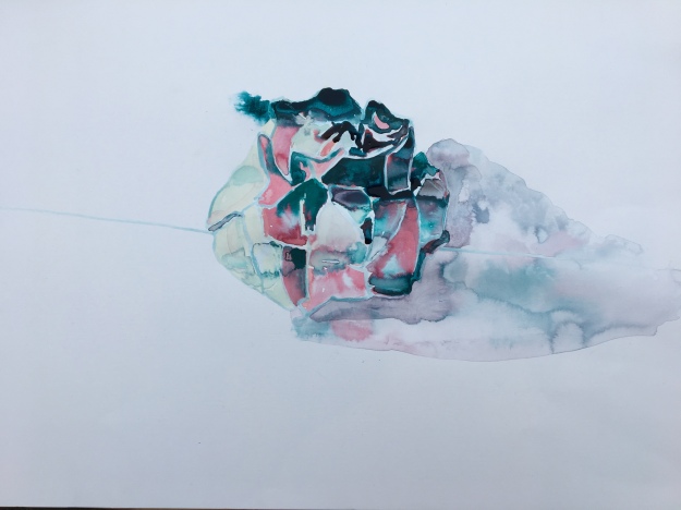
A2 acrylic ink/masking fluid on paper

Painting within each shape was quite painstaking but I liked the effects. Even the shadow ‘cauliflowered’ but after seeing the Georgia O’Keefe exhibition recently, I feel these accidental marks add something to a painting rather than it being technically perfect.

Again, not sure this is completely successful as it has lost its 3 D to become more abstract but useful techniques to try out for the future.

Did I make the paper ball my own? I certainly tried to be creative in painting it!

What could I improve next time? Developing the scraping with a card of acrylic and using masking fluid/acrylic ink. I enjoyed the tonal oil painting but that felt more traditional and not experimental.

References

  1. http://martincreed.com/site/works/work-no-88
  2. https://barbara-howey.co.uk/gallery-4/

Exercise 5.3

For this exercise I first looked at the work of Hayley Field [1]. She investigates the effects of light – one ‘Door and Floor’ has reflected light painted very successfully. The light is oblong or spherical and there are shadows along the floor boards. Some of her work is semi – abstract and she uses a naive style that I like.

Lee Maezler [2] is a realistic painter and has a successful style with the use of shadows.

I have to say that I found this exercise hard – my watercolours are probably my least used technique these days, as I find it hard to get a contemporary ‘look’. I have ordered Simon Carter’s ‘Contemporary watercolours’ book though so maybe I can get some inspiration from that?

Here’s a few sketches trying out views of the house, and different colours to work for each time of the day.

img_0253

Morning light – this faces east so the light was at its brightest but it was still an overcast day so there were no shadows.

img_0255

This was early afternoon when it was still quite light with a few shadows.

img_0256

Late afternoon and the curtains and chair were much darker.

As an extra work for this assignment, I painted a slightly different early morning view without the table in the foreground in oil;

fullsizeoutput_226a.jpeg

Oil on board A5 size

I tried an ultramarine blue and alizarin crimson tonal underpainting and let some of that show through the loose top coat. I only added cadmium yellow pale and yellow ochre as I wanted to keep the harmony of it. I used some tonking on the right hand side behind the door to give it some depth.

What went well?

This exercise really made me look at  the light although I’m not sure my watercolour skills were completely up to depicting it.

What could be improved?

I could have chosen a less complicated view, because painting the glass door was hard, and really this exercise was more about light and tones. Working on the A5 felt quite restrictive too, and I’m looking forward to some freedom now in the final assignment!

References

  1. http://www.hayleyfield.info/
  2. http://www.leemaelzer.com/

Exercise 5.2

For this exercise I was inspired by Karen Densham [1] who paints in watercolour [which seems the less preferred medium amongst contemporary painters]. She paints in a simple but effective manner and chooses unusual subjects that tend to be alone.

I looked up all artists mentioned and Richard Long [2] also appealed because of his use of found surfaces which makes me think of using a piece of slate possibly for assignment 5.

Ink paintings

For the first few I chose places that I would normally pass by without a second glance – an overpass, ugly with concrete and a locked up piece of grass decorated with graffiti.

img_0198


The overpass hadn’t even got the interest of graffiti, it was just pure grey. I liked the shapes of it though and how the roof dominates the composition.

fullsizeoutput_1f34

The next was interesting because this scruffy green space had the indignity of being locked up and not even accessible to people living nearby.

fullsizeoutput_1f2f

Next was a walkway past a church, maybe there isn’t enough interest in this one?

fullsizeoutput_1f37

Next, I painted this on holiday in Wales and this is the view from my dining table – quite a change from the first two – a more conventional pretty view. I thought the bay tree was a strong shape, and I like the negative painting of the light on the trunk which is something I’ll try to replicate in the future.

img_0197

Next was a statue that I had to look right up to so it was an unusual view, and initially I got the body length wrong but I just painted over the mistake and corrected it which looks much better even if a bit messy.

I started to think these subjects were a bit standard. I looked round for things that were more unconventional and not so much of a ‘view’. So I looked around for things that are easily missed, but are interesting in their own right…

Here are a few sketchbook notes I made as I walked around.

img_0240

The first watercolour was this charity box that despite its appealing expression, seems to barely be noticed by the crowds walking  by.

img_0238

Next was this wet floor sign, which I painted mainly wet in wet with a few shadows around it.

img_0239

I liked this stone plaque of the mermaid, which did have odd dimensions.

fullsizeoutput_1f82

This was the head of a petrol pump and I started to let the watercolour just do its thing rather than trying to control it. This was inspired by the watercolours of Elizabeth Peyton [3].

fullsizeoutput_1f84

My final experiment was of a floodlit woodland and to this I used masking fluid and salt. I left the masking fluid on it as I liked the plastic look and it still took watercolour paint on top. I like the textures I came up with here. I tried salt with black ink too and that worked, but probably not as well.

What went well?

I think I was too conventional when I started this exercise – looking at ‘views’ even if they were an over pass. I think by the end, I am really starting to look around at different things and ‘see’ around me for the first time.

What could be improved?

I need to continue looking for the overlooked which is more interesting often than the pretty stuff.

References

  1. http://karendensham.com/drawing-painting
  2. http://www.richardlong.org/drawings.html
  3. https://www.artsy.net/artist/elizabeth-peyton

Research artists part 5

Charles Avery [1]

I discovered this artist earlier this year when I saw his drawing at the Usher Gallery. I was taken by the good drawing and also that the figure had some odd features like seeing the leg through the coat and the background wellington superimposed on the foreground one. He has an imaginary world of the ‘Islanders’ inspired by his time on the island of Mull.

He has a world of imaginary creatures, where pickled eggs enslaves the eaters to the island and local hawkers sell pictures of nude women for the price of ‘peace of mind’.

What appeals to me about his work, is that this imaginary world allows him to look at his native Mull with fresh eyes. His excellent draught-man ship is a further appealing factor. That’s something that made me struggle with Tracey Emin’s drawings somewhat.

What I don’t like? He draws and sculpts but there are no paintings, which is my favourite medium. It would be nice to see more colour in his work, but it is obvious his devotion is to drawing.

How it could influence me?

Looking at the perspective of my own environment in a different way; through being small like an ant maybe. I have been trying to look at things I normally pass by which is a start!

George Shaw

This artist appeals greatly because I was able to admire his skill at his ‘back to nature’ exhibition from his residency at the National Gallery [3]. Having now tried Humbrol paints myself, my admiration increases with this tricky medium. It’s gloopy stuff that tries to spread and do its own thing and dries quickly. I really liked his subject matter too because he clearly did his own thing despite taking influences from some of the paintings in the National Gallery. He looked at woods, and thought of things that people do there secretly like urinating [pretty sure he’s done a back view of himself there], leftover porn pictures[which are quite graphic] and general rubbish – a tent, cans, an old mattress [4].

What I liked?

His technical expertise with Humbrol paint and his fresh look at a woodland setting.

What I disliked?

It would be great to see what he does with different paint too, but like Avery he has settled into what suits his own voice.

Lisa Wilkens [5]

I like the range of subjects of this artist, from masks to cooling towers and the way they are presented as small in a large frame.

I like her titles too. Without it the print above would not make as much sense, but with it I can see this is the artist herself, presenting an unconventional selfie. The clothes look formal and hair neat, and its a great view that she has swivelled round like she’s sending us to Coventry!

What I don’t like?

Would be great to see some colour too, amongst the monochrome.

Shani Rhys James

I first came across this artist on the BBC program ‘What do artists do all day’ and learnt how a lot of influence is from her immigration to the UK from Australia with her mother. Then I was reading in the 16th issue of Turps Banana magazine with her in conversation with Iwan Bala. She comments how she works in hourly bursts, making an image then pushing it around until shes satisfied with it, which clearly came across in the BBC program. She says she knocks things back until an image may or may not emerge – a sentiment I remember Maggi Hambling saying she creates by also.

I like the painterly and expressive style of her painting. What I don’t like? From the work I’ve seen, the themes seem quite similar?

Jo Persona 

I can’t find much on the internet about this artist, but I saw some paintings made with household paint in Turps banana issue 16 and really liked them. The support is lining paper, so it feels unpretentious. They all use a square support. Theres surprising colours – like green on an arm and a face of yellow, red, blue and purple – like the colours we would normally mix up to make flesh shades have been used mainly as their primary colours.

Mika Kato [6]

My tutor recommended I look at the work of this artist as I painted the Japanese perfume dolls during exercise 4.2.

This artist makes her own dolls heads to paint, out of clay – which makes it a truly unique painting. The close cropping of the head draws in the viewer I think. I admire the hyper real painting, which adds to a dreaming sort of quality in an idealised face. It makes for an odd painting. It gives me an idea of making something out of clay and painting it, which would be something new for me to try in the future.


References

  1. http://www.independent.co.uk/arts-entertainment/art/features/charles-avery-artist-i-was-kicked-out-of-central-st-martins-because-i-wanted-to-draw-and-draw-a6722746.html
  2. http://generationartscotland.org/artists/charles-avery/
  3. https://www.nationalgallery.org.uk/whats-on/exhibitions/george-shaw-my-back-to-nature
  4. https://www.theguardian.com/artanddesign/2016/may/15/my-back-to-nature-george-shaw-national-gallery-tile-hill
  5. http://www.lisawilkens.com/index.php?/about/
  6. http://whitecube.com/exhibitions/mika_kato_hoxton_square_2005/

Art Gallery Visit – Art Exchange and Contemporary Nottingham. Humeau/Otobong/Walls of freedom;street art of Egypt

Marguerite Humeau

I liked the entrance to this exhibition – walking through an almost black corridor with strange sounds that I read are a sound piece from imagined proto language when a single chance mutation allowed our ancestors to produce articulate language.

Then you emerge into a bright room with large parts of polystyrene elephants, some with bubbling boiling flasks attached. This is the artist’s imagining [with the help of experts] of the evolution of elephants if they had become sentient beings able to use language.

IMG_0061.JPG

I felt it was interesting and well thought out. The pink carpets are dyed with pigments created from the chemicals of the human body. Not sure what this meant? Is it because we would be the lower species and therefore used as we do with animals now?

The elephants are all different in their emotional states, one is getting drunk, one is engineered to be happy. The centrepiece is a matriarch that is engineered to die.

As a visual spectacle, it looked amazing. A lot of people who came in the room looked amazed but then walked out quickly! I think it’s one of those shows where you really have to read the thought behind it, and mull it over. Picking elephants as the sentient species over say, chimps is an interesting thought.

Otobong Nkanga

This artist looks at uses for stones. Images are printed on the stones, and what I liked about this is that you to look at these, you have to crunch along on smaller stones which made me feel I’m part of it.

I guess a bit of me was disappointed the images were printed on the stones, as I’m so biased towards painting! It did look interesting though and it made me wonder about using stone to make my own paint again.

Walls of freedom; street art of the Egyptian revolution

I loved this show, it explained the use of graffiti during the Egypt revolution in 2011.

I read of the atrocities of a Military sniper who tried to blind people and this artist had both eyes blinded. People killed in the revolution were painted onto walls with their stories and wings.

A continuous loop film showed this film as it went through changes by artists and government. First tanks and a boy with bread representing the innocent people. Then this was changed to the tank running over people and blood everywhere. Then, the government painted over that with flags. And then its back to the military commander as a murdering madman. It was an amazing thing to see this struggle played out on the wall.

It made me think about what these people had been through and how street art must have been so important for messages and morale, and a memorial to those lost.

IMG_0153.JPG

The Military regime blocked the square off and artists painted the view as it would be without the blockade – sorry the photo is blurred.

I must say I found this exhibition very powerful and moving. I had seen the scenes on TV, but theres something about seeing this that really bought home to me what this country went through.

There was also street art from Iran, here is a man holding a sign saying only foreign currency being accepted – from a time when their own currency was so devalued due to sanctions from foreign governments [now being lifted due to the reduction of uranium enrichment programs] and a few days later the government has removed the message on the graffiti.

Here’s a comment on foreign military being used as puppets – possibly a comment on foreign presence in Afghanistan.

I’ve started to look at graffiti around Nottingham but so far have not seen anything memorable. I’ve tried to look up a few ‘Bankys’ when I was in Bristol but either missed them or they’d been taken down. I would like to look at his work in more depth.

While all the exhibitions were interesting, I have to say the street art was educational and the most moving to me. I have ordered the book ‘Egyptian street art of the revolution’ by Basma Hamdy as I would like to read more. It also gives me an idea for looking at the graffiti in my local environment, maybe an idea for the final assignment!

Exercise 5.1

I looked at some artists before I painted this…Richard Dadd [1], I’ve already looked at, as he his photo of him painting came up in the Wellcome collection Bedlam exhibition.

I have also been lucky enough to see Mimei Thompson’s [2] Cave painting [Panorama 2] up close at the Syson Gallery visit a few months ago and I wondered then how she loaded her brush to produce those different colours along the length of the mark.

Her weeds paintings are vibrant and she uses a fairly sparse composition, which I wanted to take inspiration from. Her greens are bright. She outlines some of her marks in a dark tone that I’ve seen Van Gogh do. She makes it look alive and dynamic.


I decided to really try and experiment in these last exercises. First I tried some masking fluid and layers of watercolour, then again with different colours.

The first was with just masking fluid and layer yellow, alizarin crimson and indigo blue in a fairly random fashion. Then I tried a lighter blue in the next, as well as sprinkling some salt, but wasn’t sure this was the effect I wanted.

I really liked this painting by Natalie Dowse as it gives such atmosphere – and I wondered what media I could experiment with to get that effect without using oil paints.

I have used bleach on wet black ink before, and I wondered how that would work on a ground of acrylic, because I thought the bleach being so plastic when dry wouldn’t be affected by the bleach. I tried out a few samples and was quite pleased with how that went. The effects of the bleach on the wet ink can be unpredictable.

I did not think my experiments so far had the range of tones I wanted – the first was dark and light and the second was more mid tone and dark.

fullsizeoutput_1f00

A3 acrylic paper – acrylic paint, Quink ink and bleach

So I painted a few light stems on in acrylic paint with white and red oxide and I think that gave the definition I was looking for. Drawing stems through the layers of ink as it dried gave it a multi layered effect.

What could be improved?

It’s not nearly as defined as the Mimei Thompson works and apart from the lighter foreground weeds, it just looks like a tangled mass – but thats probably more representative of the weeds I was trying to paint! The Quink ink was not so powerful on top of the acrylic as it was on white paper, so I wonder if bleach works through a dark wet acrylic colour. An experiment for another day, as I feel quite exhausted after this 6 hour marathon!


References

  1. https://www.theguardian.com/artanddesign/jonathanjonesblog/2015/jun/17/richard-dadd-victorian-artist-bedlam-mental-illness-fairies
  2. http://mimeithompson.com/work/

Art Gallery Visit – Elpida Hadzi-Vasileva Lakeside gallery Nottingham

This was a strange exhibition, which didn’t really appeal to me as a vegetarian! The smell when  entered reminded me of preserved corpses from anatomy at university, not that pleasant – like window leathers.

I have to say that the effect of preserved pig guts as you walked in was quite spectacular. It looked like a strange religous space.

img_0007

img_0008

The stomach of a cow preserved with guts trailing from it appeared to be like a strange altar.

The drapes of caul fat are illuminated in an interesting way, which highlights their delicacy. There was certainly no escaping these were made from organic matter.

The artist has researched her pieces, with 2 years of witnessing endoscopies of the digestive tract and interviewing patients.

I admire the fact she has found beauty in these organs that would be cast out otherwise or go into pet food.

img_0009

Above is ‘Manometry 2016’ which is copper wire on linen, and made me think how metal doesn’t have to be just painted on, it can be used in many more creative ways like this. Most people wouldn’t know what monometry is – but I guess this is a pH graph from a wire being inserted into someones stomach acid. It’s a beautiful representation of that.

img_0014

Gill’s Slits 2011

I liked this sculpture made of skate wings because the clamps holding it together are quite clumsy and I think that highlights the delicacy of the bones.

I must admit I hurried through the preserved pigs stomachs and purses made of sheep testes.

From this show, I would like to take away the idea of looking at every day things and making them interesting. Since I’m wondering about developing medical themes further, I’m really glad I didn’t avoid this exhibition just because of the animal remains, although I don’t know if I could look at work that is more graphic than this!

OCA Study visit – Yorkshire sculpture park

A cold morning welcomed us to the fantastic sculpture park. There are sculptures everywhere, sheep graze around them.

I took an A2 board and charcoal, which was a bit cumbersome, but I’ve found after A1 drawing in D1 that I like drawing big! We started with this Henry Moore statue. The head is square and tiny compared to the rest of the body so it seemed important to emphasise that, and not let the head drift to normal size!

img_0029

Next, we visited the Longside gallery where Ryan Gander was curating ‘Night in the museum. Here is my A2 sketch of Jacob Epstien’s ‘Bust of Meum 1916-18’. I really liked how she looked so thoughtful with a slightly open mouth.

fullsizeoutput_1e3c

Next, I thought I’d challenge myself with the twisted pose of Uli Nimptsch ‘seated figure 1951’ but I ran out of time as we needed to move on to the next sketching destination.

I had a chance to look round this show and I liked the Ben Nicholson on display, because it has an interesting composition that is multi-layered.

img_9964

Ben Nicholson Feb 25 1963

Moving on to our final destination, I sketched a rather odd hare/human hybrid…

fullsizeoutput_1e4c

This was a huge 2.5 metre sculpture made of textured material and was an odd sight but so interesting to draw!

As always on these study visits, having a chance to chat to tutors and students really made the day. It also made me think how much my drawing has improved in the last year, as I would never have tackled the human figure then, let alone with such a large board! I think these would be great to develop with oil painting using rags.

Assignment 4

I have painted areas of my house before, and this time I wanted to make this an unusual view. I took inspiration from Henny Acloque’s work [1] that I discussed in my research of artists in part 4, in that she adds an unusual dimension to her work.

It took me a while to decide what to do. I had ideas about the view from the dolls house in my lounge.

I thought this might work because the wooden figures look a bit odd.

However, when I tried that out with acrylic paint, I wasn’t convinced that it worked. So I read a tutorial on mind maps and tried brainstorming that way, which I found quite an interesting experience. It certainly made me think in a more visual way, especially putting in pictures and using one word on the branches.

So I looked around for more unusual views, and in looking down into a wine rack, I wondered about looking out from cupboards and in through doorways.

This gave me the idea of the view from outside looking in through the letterbox, like an unwelcome viewer might have. Someone who is not given access to the house, how could they still look in ?

I wondered how much of the house to put in, and whether to leave the finger in the letterbox, but I decided that added another interesting shape, and maybe a clue to what it was. This tondo is 30cm diameter. I thought the paint layers made it look flat and wondered about developing it with another try using thinned acrylic layers more like a watercolour wash.

fullsizeoutput_1d96

30cm thinned acrylic on white gesso paper

fullsizeoutput_1d97

30cm acrylic using rags on acrylic paper

I also tried using rags after being inspired by Emily Ball’s book for life drawing [discussed in non course work part 4]. I wasn’t sure this was successful because it’s already a view that is not easily recognisable so perhaps that technique is best kept for stronger shapes, or it turns into an abstract view, which is not a bad thing but not what I had in mind here.

In my mind map I had put a photo of Luc Tuymen’s painting ‘The Shore’ which I had seen recently at the Tate Modern and liked the monochrome effect. I tried this out as a 30cm version and liked the direction. So I wanted to try this in a bigger format and with a ground of mid toned shorter strokes of paint – using a 42cm acrylic paper seen in picture 3.

I also wandered about using the light effect of Miriam Cabessa [2] as discussed in research on artists in part 4 but again, wondered if the effect would be too abstract. So I went for wet in wet painting on top of the ground seen above.

My tutor recommended Rezi Van Lankveld [4] and I liked her work I bought her book ‘At the first clear sight’ which has the painting ‘Ideas of a solution’ in seen below and painted in 2005. I like loose brushwork and how the image is built forward from the black ground.

img_9951

42 cm acrylic on white gesso acrylic paper

I decided to keep it simple because using too much detail would just look confusing. I also mainly used big household brushes which forced me to keep it loose. Looking at the work of Tori Day [3] I think my composition was influenced by her, in the way she keeps it simple, but also adds something unexpected, like a pegged backing paper. This is why I kept the finger keeping the letterbox open. I used dry stokes to add reflection on the plastic and thick pain in ridges for the straps on the rucksack.

Demonstration of visual skills; I think this shows experimentation with composition and materials. Although I’ve stuck with acrylic paint because of drying time, I tried different sized brushes, rags and worked up different compositions to see what worked best.

Quality of outcome; I think trying the mind map for the first time helped to refine ideas and will be something I’ll use in future. I’m getting better at trying out a few things as experiments rather than sticking with the original idea in a concrete way.

Demonstration of creativity; I’m realising that more original ideas take time to form, and it took a few weeks of looking around the house before I thought of any of these ideas. It would have been easy to develop a previous exercise but I really felt I wanted to go further with creative thinking. Other ideas I’ve had since for example the view of an ant on the floor, or even the dolls house I might take forward later on. I can appreciate these ideas might become relevant in the future.

Context; I’ve spent a lot of this course looking at other artists and going on as many study visits as possible. I think this may have made up about a third of the time on the course really. Some things I’ve liked and others not so much and generally I have reasons for that.

16/11/16 – response to tutor feedback;

My tutor commented that assignment 4 was clumsy compared to previous sketches, and I took another look. I realised that I had carried on with paintings and not looked at all the development work to see which actually was the most successful. The view through a letterbox is obscure enough that a more realistic painting means the original concept is not lost.

So I choose as my assignment 4 work;

fullsizeoutput_1d92

Assignment 4 – acrylic on gesso paper 30cm

Looking now with fresh eyes, I see there is a range of thick and thin paint, and a good tonal range. I think the varity makes it more successful than the similar more thinned acrylic version I made. It is still loosely painted. Very grateful to my tutor for pointing this out, as sometimes I realise I push on with works and don’t look back to see what worked better than the ‘final’ version!


References

  1. http://www.hennyacloque.com/
  2. http://www.miriamcabessa.com/
  3. http://www.toridayart.co.uk/
  4. https://www.theguardian.com/artanddesign/2010/jun/10/artist-rezi-van-lankveld

Art Gallery visit – Wellcome collection, London

I was looking forward to seeing this collection of medical curiosities from Henry Wellcome’s travels and was not disappointed. There is also an exhibition of ‘Bedlam’ explaining the origins of the word from Bethlem Hospital for the insane. Plenty of odd equipments used and tales of life from those days. I found the photographs of some of the patients very interesting to see their expressions, as well as the explanation that the photos were taken to ‘help’ them.

img_9918

I couldn’t help but think these people were at the mercy of their carers and the advantage that could have been taken of them.

img_9917

Henry Hering. Richard Dadd at work. 1857 photograph

I had not heard of the artist Richard Dadd, but have read of his sad history since [1]- noted for his fairy paintings in the Victorian era. He came back from a tour of Europe ‘insane’. stabbed hsi father to death and spent 42 years in a mental hospital where he died. Here he’s painting a circular canvas which is relevent to the this part of the course!

img_9926

L’homme a la pipe. Van Gogh. 1890

This exhibition also had Van’ Gogh’s only etching. It is of his psychiatrist and he described him as ‘like a brother and very nervous and very bizarre in himself’. I think this comes across in this face – it looks full of character, even when in this thoughtful pose. The fingers look exaggerated, which I remember from his character in the ‘Potato eaters’. The face is a little cartoon like. If it was his only etching, I would guess it was not a method that inspired him?

img_9924

Morphinomane. Eugene Grasset. 1897

This lithograph must have been shocking in its time. Even in contemporary painting, I don’t come across themes of drug addiction very often. The expression on her face is really tormented, it makes me think why did she do this – the grimness of prostitution is unimaginable. I thought this was a very successful work and one I won’t forget for a long time. Maybe it speaks to me because I’ve worked with substance misusers? I hope theres more understanding now, as I can imagine back then there was a lot of horror with it.

I also saw a print I have seen before of the collections theme.

img_9940

Andrea Duncan Twenty three pairs. 2002

I thought this was an ingenious idea form her haematology residency of chromosome pairs represented by socks!

IMG_9930.JPG

There are cabinet after cabinet of interesting medical objects – trephinned skulls, old appliances, amputuation saws, even a guillotine. As I wonder about medical themes in my personal voice, I’m sure this visit will be looked back on as a sourc eof inspiration!

References

  1. http://www.tate.org.uk/art/artists/richard-dadd-130