

I’m getting quicker at the painting and here more brush strokes stand out. I have added a bit of paint to make the eyes stand out. I added too much under the chin which makes it look like my daughter hasn’t had a bath in a week. Removing paint is easier if using a tiny bit of turps too, otherwise it smears.


This is from a life drawing I did, so I didn’t have the live model in front of me, I had to use my original painting [in part 3 non course work on this blog]. That makes it harder, as I have to rely on me getting that painting right! I actually prefer the second print off it, it hasn’t reproduced so well here, but it looks more delicate in real life. The first one lacks some tones. I’ve realised that dark prints better than light, so with the retouching, it’s likely to be the lights that need it.

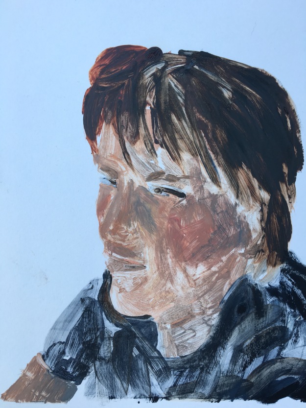
I decided to try a background – a big brush to do it quickly as the figure was starting to dry. It’s quite roughly done, but I think it enhances it. I had to add some paint to the face, but I think it’s come out a bit mask like.
I like this view looking down. But I took too long painting it, and it did not come out so well. A lot of light areas, and the eye looks quite crude. Definitely one to think of adding some paint to.


Inspired by the Kim Baker paintings on a black ground, I took a print on white paper, then a faint one black paper. That didn’t work well, made me see how you have to mix smooth paint not to leave splodges. So I painted back on the glass and tried again. It was easier as there was already an outline. I think the black paper is more successful than the white. The white paper needs more paint I think, but doesn’t reproduce well here.
What went well?
I’m getting more used to handling the paint for this process, speeding up and using simple shapes. Bigger brushes help keep the paint smoother.
What could be improved?
Continuing practice is needed to get better images. I want to have a change of media too, because it would be good to try some inks, or acrylic – but that would need a lot of medium to make it dry slower. I want to start being more creative too – using different colours on one brush edge and going for a more abstract image by using a rag. I think I’ve been very figurative in practicing prints and it will be good to go in a different direction soon.

You really have developed a loose style Catherine. Well done!
LikeLiked by 1 person
Thanks Roselyne! The printing is such fun, you will love it!
LikeLike
These are looking great Catherine! Fluid and expressive – I can see you’re enjoying it
LikeLiked by 1 person
I’m finding with printing on hot weather I have to be quick Arlene!
LikeLiked by 1 person
True! Are you using oil paint ?
LikeLiked by 1 person
Yes, but I’m ready to try some different medium now – did you use printing ink or anything else?
LikeLike
I thought about switching to printing ink but in the end decided to stay with the oils and get more experience with that. I thought if I change I’ll take longer getting used to it – I’m short for time otherwise I would have enjoyed experimenting some more.
LikeLike
Yes so far, did you use anything else? Do you need special printing inks at all?
LikeLike